
Logo and brand system design
A mark that still reads at 16 pixels, colors with contrast we measured, and the written rules that keep both consistent everywhere you use them.
Where most logo hand-offs stop
Most branding hand-offs end with a big image file and a couple of hex codes. Then the questions start: what goes in the browser tab, what goes on the dark footer, which blue is the real blue, how small is too small. Whoever builds the site answers those by guessing, and the brand drifts a little with every guess.
We draw the mark and then finish the job around it. That means a set of lockups for the places a logo actually lands, the export sizes each of those needs, contrast measured rather than assumed, and a written guide that says what is allowed and what is not. We drew the Modulus Biotech identity, and the brand this site wears is our own, documented the same way and kept current as the site changes.
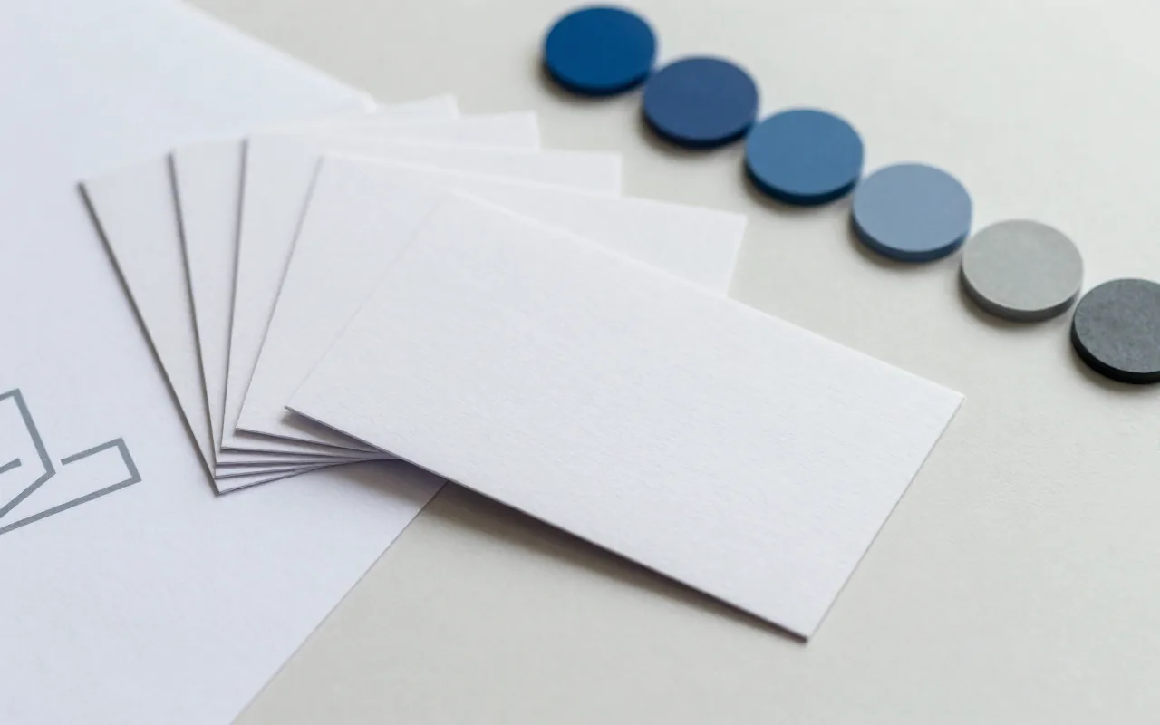
What’s included
The mark
An original logo drawn for the business, delivered as vector masters that stay sharp at any size.
Lockups for real placements
Horizontal, stacked, and mark-only versions, each with a light and a dark-background variant, plus the rule for when to use which.
The export set
Favicons, app icons, profile avatars, and email signature art, cut to the sizes each platform asks for so nobody is resizing by hand.
Palette and type
Named colors with measured contrast ratios, a type scale, and a spacing scale, written as tokens a developer can implement directly.
A written guide
Clear space, minimum sizes, and an explicit do-not list, kept as a living document rather than a PDF that goes stale.
Brand carried into the build
When we build the site too, the guidelines and the stylesheet stay in step because the same shop maintains both.
Questions owners ask
Do I get just a logo, or something I can actually use?
Both. The logo comes as vector masters plus every size and background you will be asked for: favicons, an app icon, profile avatars, an email signature lockup. Hand over one big image file instead and you spend the next year cropping it badly in whatever tool is open.
What if I already have a logo I like?
Then we build the system around it rather than talk you out of it. That usually means tracing clean vectors, picking the palette and type that go with it, deciding the rules for small sizes and dark backgrounds, and writing the whole thing down.
Does the brand carry through to the website?
That is the point of doing both here. The palette becomes the site’s CSS tokens, so the build reads from the same colors the guidelines specify instead of a developer eyeballing a screenshot.
How do you know a color is readable?
We measure it. Every text-and-background pair in a system we deliver gets a contrast ratio against the WCAG thresholds, and the ones that fail are written down as banned rather than left for someone to discover later.
Related reading
-
How AI fits into creative work without the slop
Where AI helps in design work and where it falls down, and why a person still has to make the calls that keep the result from being slop.
-
Brand consistency between your website and your email
Why email cannot just reuse your website’s design, the written rules that keep both surfaces on one brand, and what we fixed when our own mail drifted.
-
What makes a logo work at favicon size
Why marks that look fine on a business card fall apart in a browser tab, and the rules we use to keep one legible down to 16 pixels.
Need a mark that works everywhere?
Tell us what you have today and where it keeps falling apart. You’ll get a plain answer about what a system for it involves.